
Interaction of Colour
/“Colour deceives continually.”
This is the famous line coined by the Master of colour, Josef Albers. There is no denying the contribution and influence that Albers has had on the approach to, the understanding of colour and its simultaneous contrast and relativity. Known for his ground breaking teaching method, ‘Interaction of Colour,’ and the famous series, “Homage to the Square,’ Albers has taught and sparked in the hearts and the minds of so many artists, architects and teachers alike; a new way of seeing colour.
“Hundreds of people can talk, for one who can think.” John Ruskin said, “But thousands of people can think, for one who can see.” Albers had a deep fondness for these words, and it could be argued, been the foundational and fertile ground for his approach to this new way of seeing colour.
In an introduction to an art exhibition at the Artichoke Gallery in Toronto, Renowned Clinical Psychologist Jordan Peterson, describing the role of the Artist, explains to his audience that the primary role of an Artist is to, “...teach you how to see.” When an artist teaches you how to see through their work, then “you can't be perceptually lazy. You have to pay attention. And good art should make you pay attention. And good art will make you see things in a new way. And I mean that literally; I don’t mean that metaphorically, because artists are geniuses at perception - they teach you how to be smarter at seeing things and seeing things is by no means just looking at what’s there and noticing... It's like, what's there, that’s a complicated problem and there’s lots of ways to see what’s there.”
This is what Albers did in his Interaction of colour, which realised the miraculous way in which this method facilitates such seeing. Interaction of colour was a “grand passport to perception,” as was hailed by one reviewer of the 1963 best seller. Albers’ approach was revolutionary, putting experimentation at the forefront, as he sought to engage, rather than inform.
Ok, so what is this new way of seeing colour?
Colour is probably the most relative medium in art; it has many faces. Albers describes it in two ways; actual and factual - meaning, factual is what the colour is in isolation and actual is how the colour appears when it is in context. If one says, “Red” (the name of the colour), what does one actually mean? Albers explains that language is inadequate in describing what a colour is, thus, he tells us, that colour deceives continually. “The aim of our studies,” Albers says, “is to prove that colour is the most relative means of artistic expression, that we never really perceive what colour is physically.”
He demonstrated the different ways in which we perceive colour - colours change according to their settings and his experiments and paintings provide evidence to this exciting manner in which they do change; revealing a perception that destabilises us in a very provocative and thrilling way.
Take a look at the below image. The little square sitting at the centre at the far right and far left panel is actually the same colour - but because of its setting of context or colour contrast, we see that they seem to be two very different colours, when in actual fact, they are exactly the same colour. Imagine, if you will, that we removed the yellow and dark blue vertical rectangle - the horizontal rectangle, is in fact, part of the same strip.
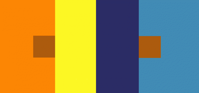
Josef Albers, Interaction of Colour, 1963
Chapter IV-I
Or, take a look at the grills below – they are both the same colour, but appear to be different in different settings.

Josef Albers, Interaction of Colour, 1963
Chapter IV-3
Here’s an experiment you can take part in. Have a look at the below image - on your left, there is a black dot in the middle of the yellow circle. Keep your eye focused on that black dot and count for 30 seconds, and then shift your eye to the right.

Josef Albers, Interaction of Colour, 1963
Chapter VIII-2
What did you see? If you did the experiment properly, you would have seen a series of yellow triangles in the white square.
You may have put this down to being an illusion, but science tells us to recognise that all of this is an experience of the retina and the human mind. Albers took these principles and applied them to the art of painting.
‘The Homage to the Square,’ is easily one of the most recognisable bodies of work from the 20th Century; consisting of more than 2000 paintings. Whether one has seen these pieces hanging proudly at their State Gallery, in a photograph in the dining room of Casa Barragan, in a book, or as has been the case lately, in a post on Instagram, perhaps - there is no denying the proliferation that these squares have had in our lives, especially if one comes from the world of design. But to the person who does not understand what the big fuss is about - why anyone would even consider a series of painted squares, art - one needs to understand, as Peterson has stated, what the artist is doing; how he is changing and teaching us about the perception of colour.
‘The Homage to the Square’ uses very simple language to do this teaching, which is perhaps, in some minds, the scandal that might question its validity and claim to be called a legitimate piece of art. But remember, Albers was trying to push the envelope, and as has been noted before; he sought to engage, rather than inform. The purity of the squares and the wonder of colour are constantly pushing them in new directions. Motions change when the colours change; even if one is looking at what is factually the same painting. Abers wanted people to look at colour attentively. He wanted us to pay attention, and in some ways, his results are put on display regarding the importance of colour and its interaction. Albers tells us, “Simultaneous contrast is not just a curious optical phenomenon - it is the very heart of painting.”
Donald Judd was a great admirer of Albers’ work and in his essays, Judd expands on this when he says, “Albers says, with regard to one study, ‘We study this first, not as a surprising or entertaining illusion but to make eyes and mind aware of the wonders of color interaction; second, to learn to utilize color deception in creative color performance.’ ‘The book Interaction of Color is a record of an experimental way of studying color and of teaching color.’ The book makes, to put it simply, one unqualified point, that color is important in art. It does this very well. Of course the book is also showing a particular way, contemporary now, in which color is important. Most of the studies would have been only entertaining illusions a few decades ago. The plain fact of color in art, the specific use of these effects in art, which is contemporary, and Albers’ experimental way of teaching color are the real contributions of the book. Albers’ remarks are original, not about the simple existence of an effect, but about how it works in art. The experimental way is also original and is fine. Albers’ way of teaching has been and should be very useful. It is hardly irrelevant that he is an exceptional painter.”
In the 1963 Architectural Forum, a design teacher at Cooper Union was among those prescient enough to write, “Interacting of Colour is the most comprehensive and intelligent, as well as the handsomest, book we yet have on this subject. It is an indispensable volume for the artist, architect, or teacher who finds a greater challenge in discovery than in a ‘safe’ colour system.”
Albers’ maxim - “I want to open eyes” inspired an entire generation of Artists. He never tired of seeing and rediscovering colour in all its variation, ranging from rationality to sensibility. His message is therefore simple: one sometimes does not see what is actually there, but without vision, everything is nothing.
In a world that is constantly in a haste, Albers invites us to stop and reflect on the simplicity of his work and to ponder on how colour interacts with one another. Next time you come across one of these works, stop for a moment and consider, as Albers intended us to do - to really see.
I will finish off by leaving you with his words...
“Instead of art I have taught philosophy. Though technique for me is a big word, I never have taught how to paint. All my doing was to make people to see.” - Josef Albers
Below is the final work painted by Albers before his death - it provides a small glimpse into his perception before he was finally taken from the Earth; to the cosmos, as he reveals.

Josef Albers died on 25 March 1976. He completed his last painting two months earlier. He saw the central square as the cosmos. "The cosmos should have neither sharp boundaries nor corners," Josef said, which required its color to have the same light intensity as the other two. Josef procured enough of the requisite paint to make the middle square large and seemingly close,
"Because the cosmos is getting nearer to me."